Tokyo 2020(2021 🤷🏻♂️)
Client
Nike Global
Discipline
Typeface Design
Roles
Visual Design
You set goals, you create a bucket-list for what you want to accomplish in a design career. Sometimes a pinch yourself moment arises that wasn’t close to your spectrum of imagination.
The closing ceremony for the Winter Olympics had just wrapped when the first seeds were planted to begin work on Tokyo 2020.
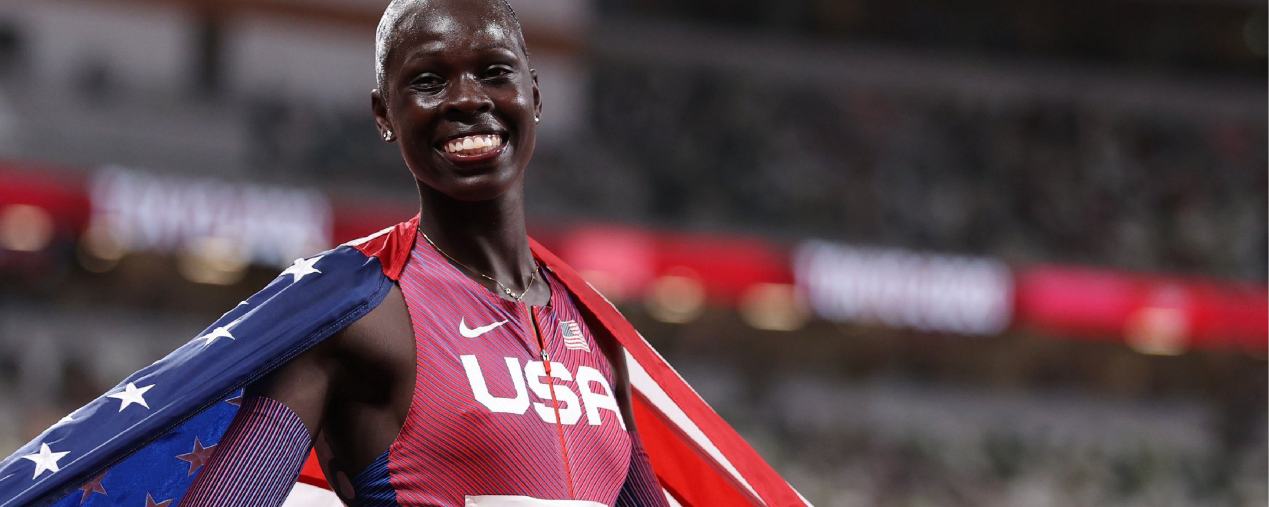
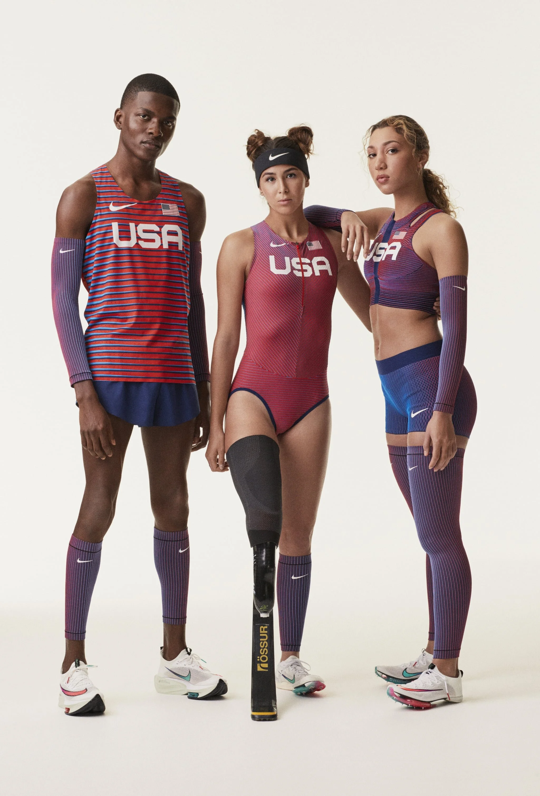
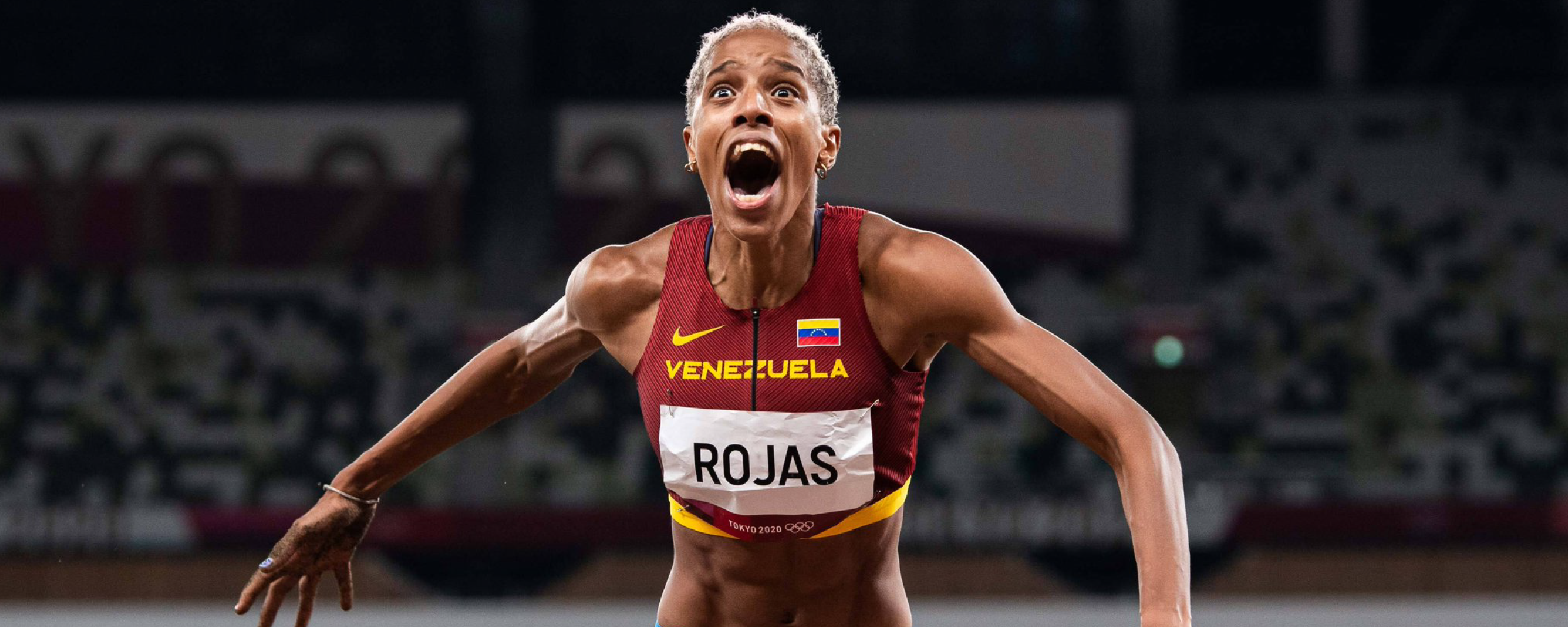
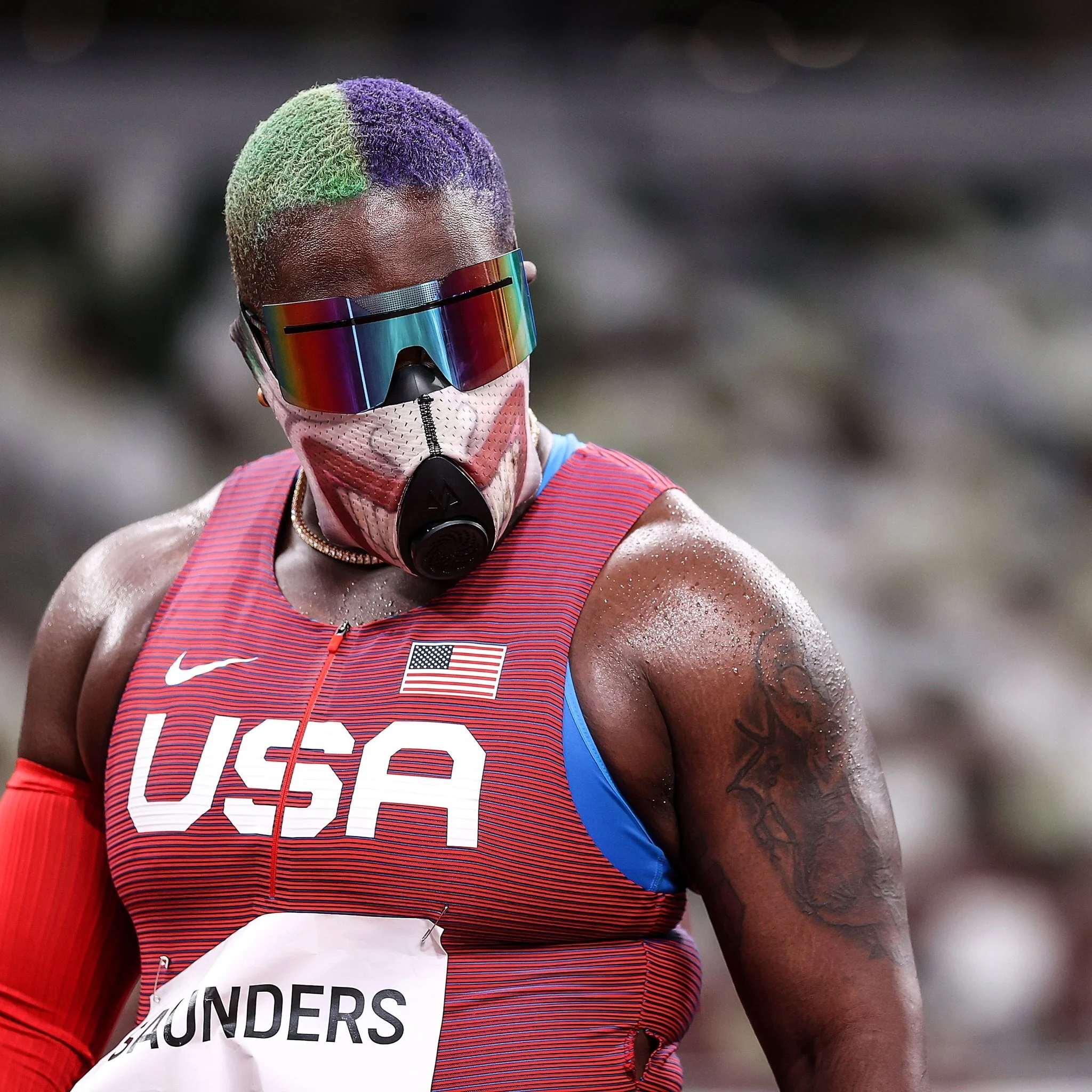
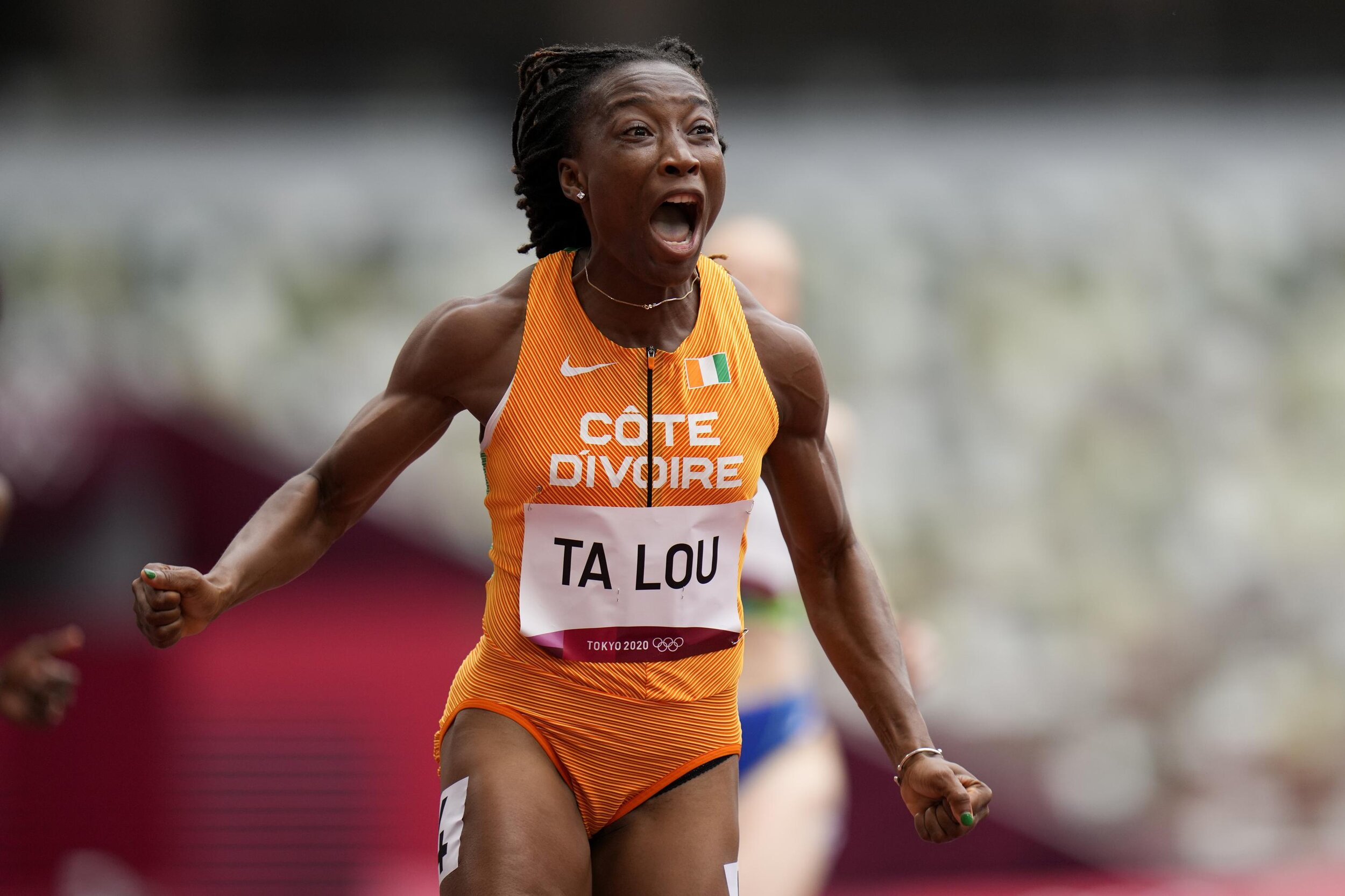
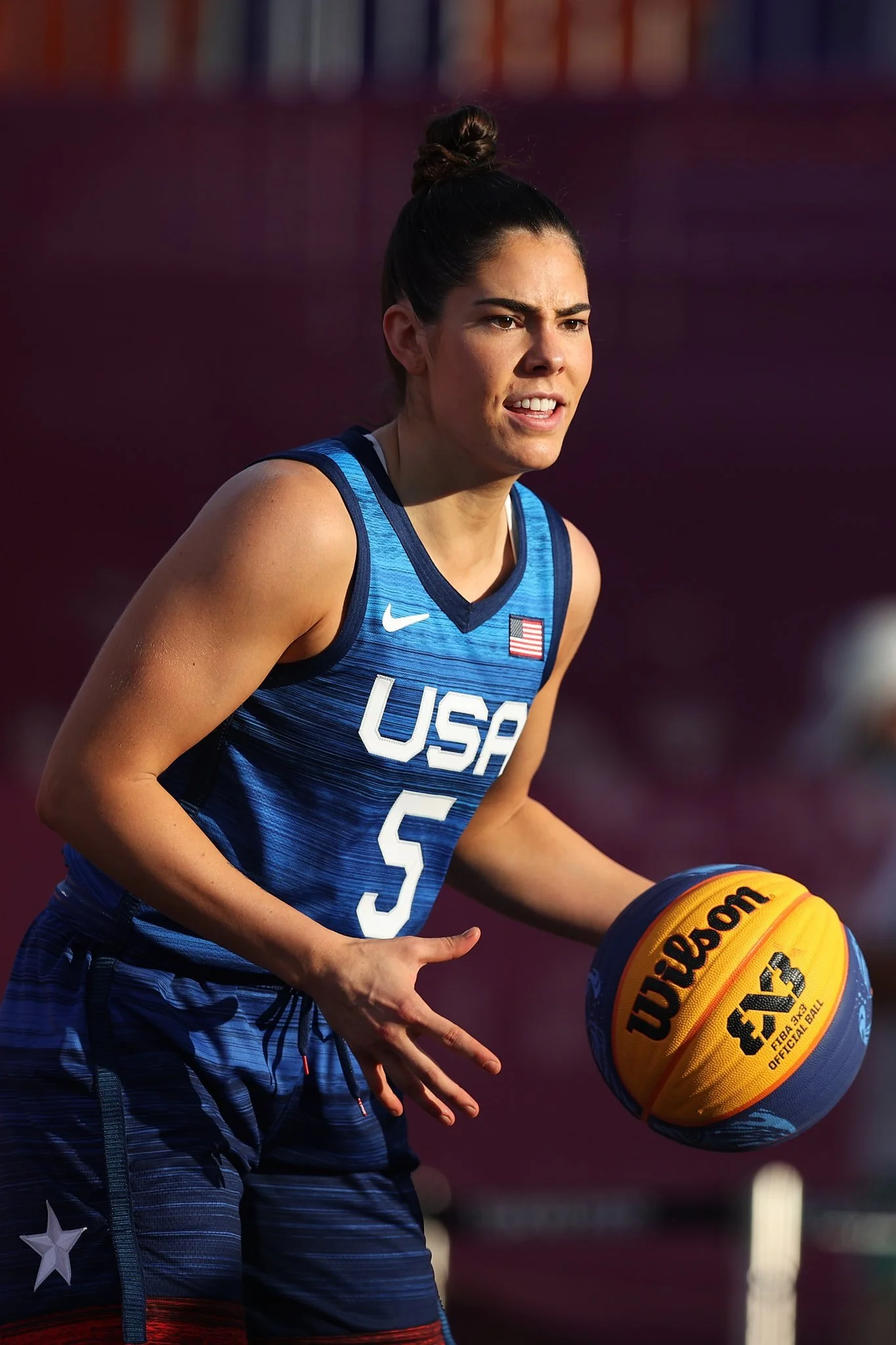
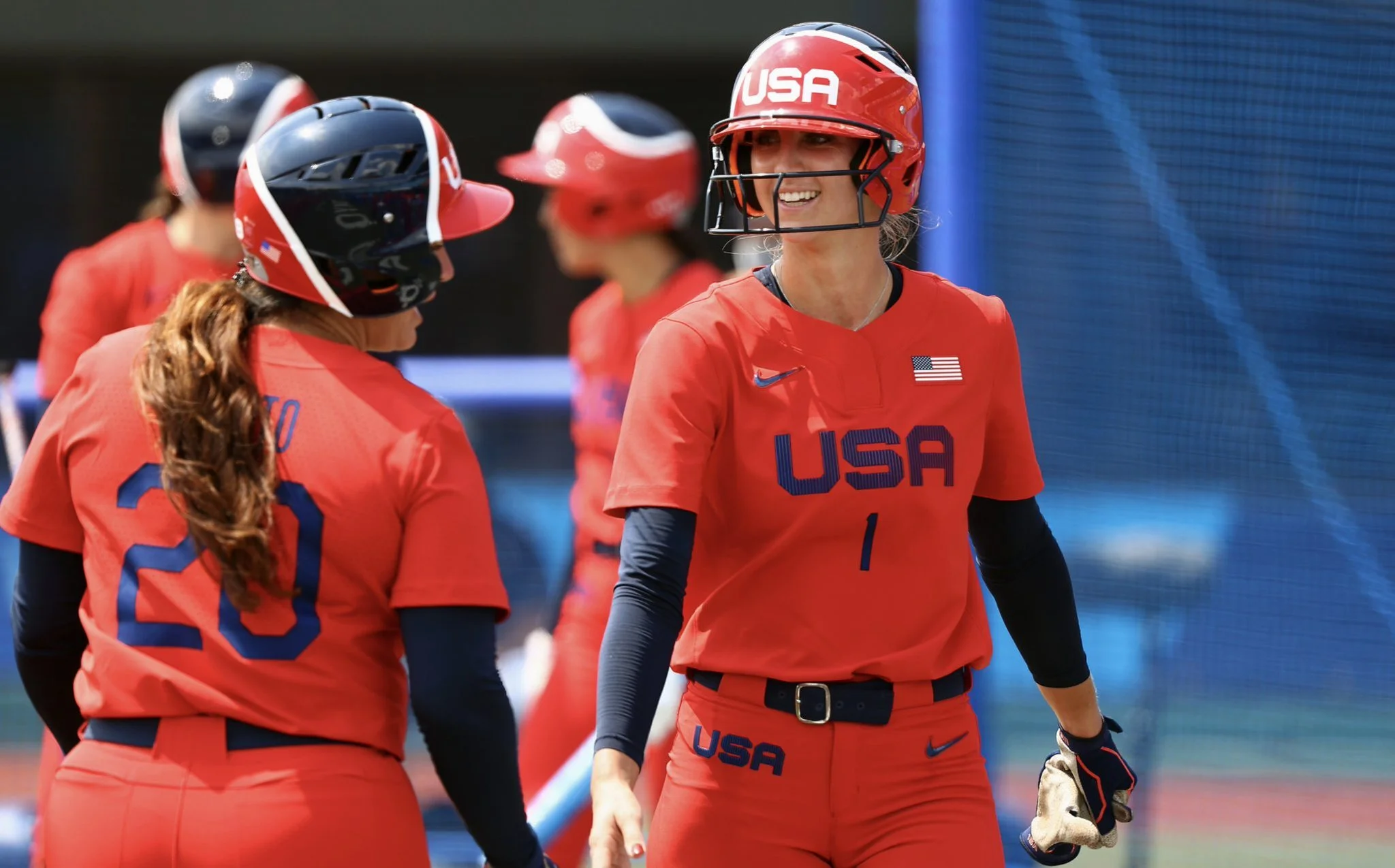
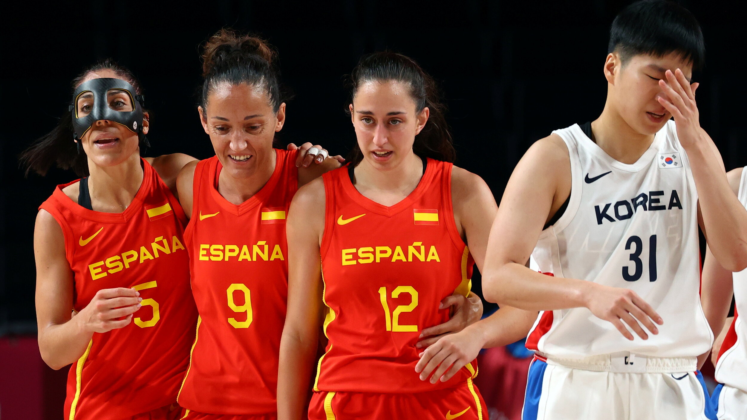
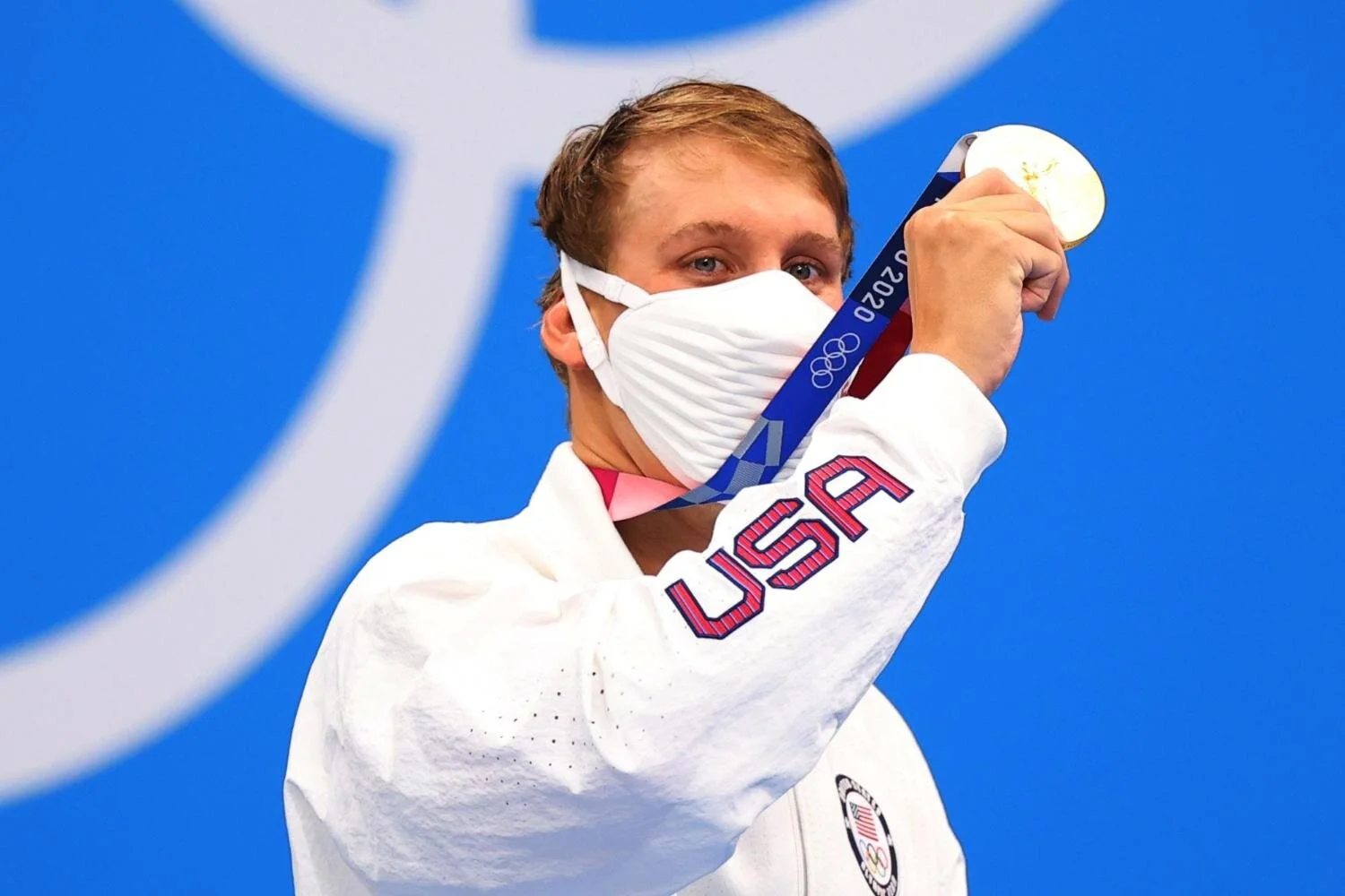
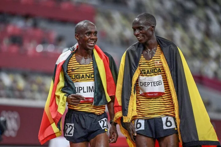
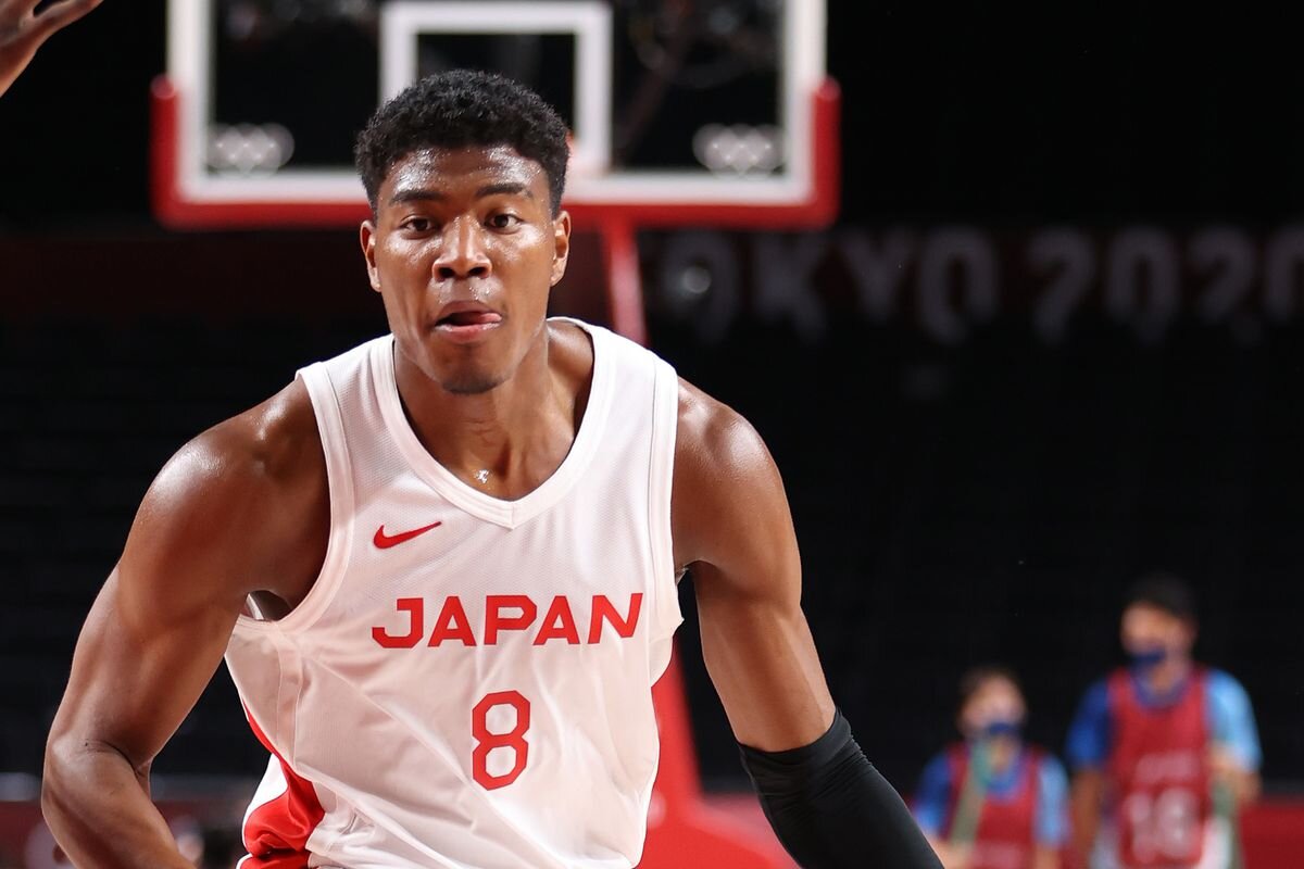
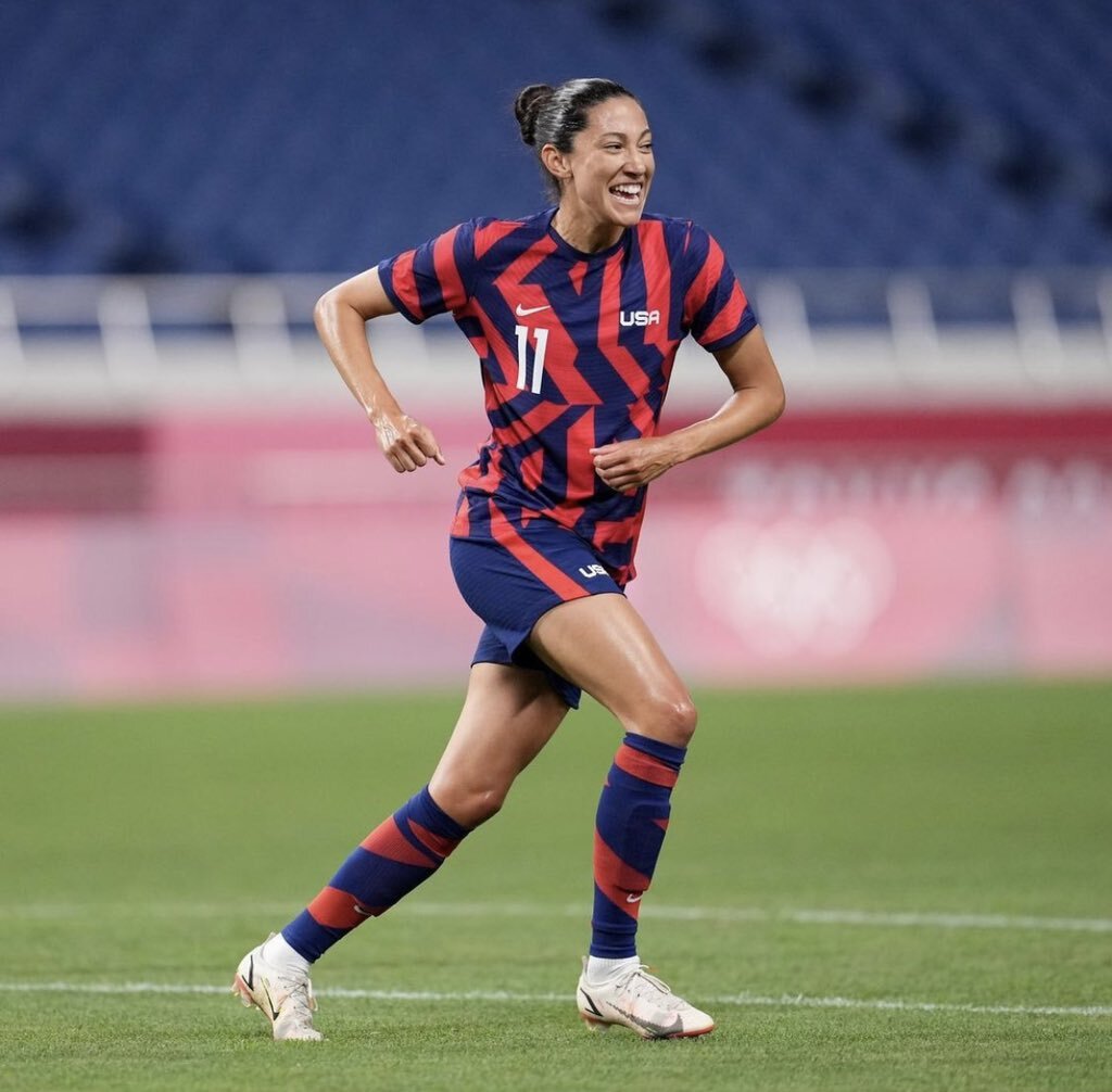
The responsibility to create a a letterset was placed in front of me. This typeface’s journey was going to be a path of functionality. It was to be applied on the 2020 Athletics Uniform pieces that were engineered from an entirely new Nike Dri-FIT Aeroswift material. Its other goal was to be readable by the timekeeper's and television viewers. The legibility for non-english speaking athletes was also highly considered, keeping anything abstract out of the equation was important.
The font was created with 3 weights and 2 widths, with a grid potential to bring into a variable font for use outside of the uniform kit application.The letterset is named after the original name of Tokyo,
EAST CAPITAL.


2020 came and went with the world locked down and life put on hold as the globe was thrust into a future unknown buried in a pandemic. The competing of the Tokyo Olympics felt like insignificant compared to the loss that we were experiencing together as humanity.
2021 appeared with a light at the end of the tunnel, one of those beacons was the Tokyo Olympics. This event was the culmination of countless people over many years striving for the same goal. Having a part in this slice of Olympic history with Nike Design will always be a pinch yourself moment.


*WORK DONE AS AN EMPLOYEE OF NIKE INC.